New image found from ben 10 reboot fake or real???
-
oh come on i cant believe they are gonna name it Ben 10: Reboot id rather it be called Ben 10: Its Hero Time
wait wasnt part of the logo supposed to be this
I mean i know the logos change but i wanted a new take on the ben 10 logo and was warming up to the new one. -
@Omni-Triforcer Like I said, if this really is the official name for the reboot, then this is just lazy as all hell. If CN and their employees can't even put in enough time and effort just to make a suitable and fitting title name for the Ben 10 reboot, then I couldn't even imagine just how little effort they're putting in for the show itself.
-
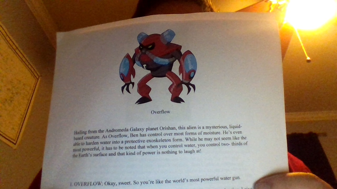
That is not real, but this is!
-
@chronosapien234 Wow, you finally released an image from the Ben 10 reboot artwork. Finally. Just finally. Ok, you finally showed proof of your information. This looks right for the Ben 10 reboot so I guess your information really is true after all. Glad that you finally came around to posting at least something. Especially when we haven't been receiving anything more about the reboot lately.
-
@chronosapien234 Wait a minute, is that image on a script or something?
-
overflow looks really cool
-
@Omni-Triforcer For me, this sums up exactly what I said a while back. Overflow is just basically a copycat of Water Hazard. No, scratch that. Overflow is Water Hazard but way too powerful considering that he can control all of the earth's water. Generic, unoriginal, and unbalanced. The design of Overflow, much like the design of Diamindhead, Cannonbolt, and Four Arms, reminds me of Omniverse. In fact, it kind of looks like Overflow was drawn in Omniverse's art style. It's the Ben 10 sequels all over again.
-
@chronosapien234 So you weren't lying after all. Cool!
-
Overflow looks pretty cool.
@chronosapien234 Do you have any other Ben 10 reboot images? -
oh... yeah...

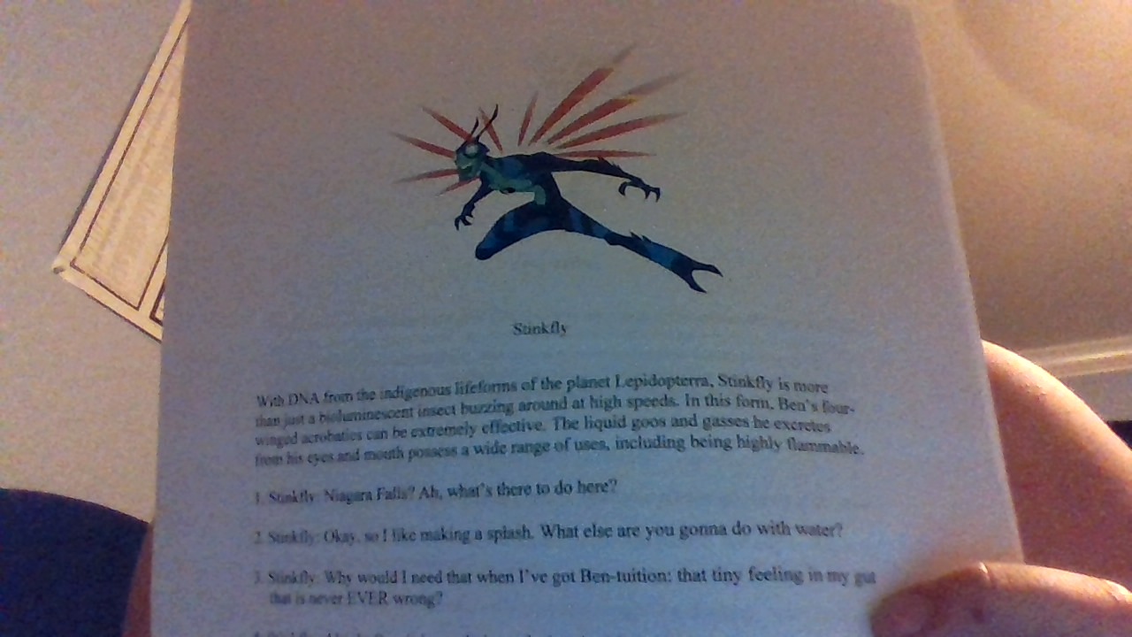
-
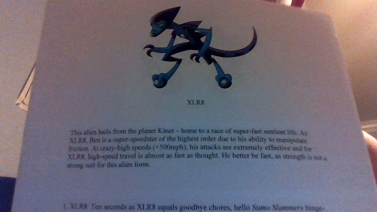
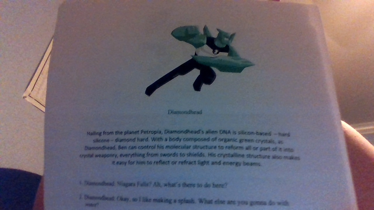
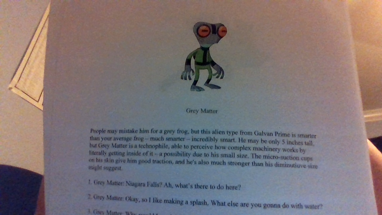
I don't care for Stinkfly's design too much. As for Diamondhead, his design is different from the one we saw on the calendar. XLR8 looks pretty cool and I'm fine with Grey Matter.
-
@Ben-10-Fan As for the main topic of this thread, I can confirm that Facebook page is definitely fake; they've reposted several pieces of fan art, two pieces being mine, so I wouldn't trust that as a source. Best advice is to block them and report them.
As for the "official art" @chronosapien234 posted in the thread... /some/ of the art is believable but in terms of Cartoon Network's non-disclosure agreement (which, if chrono was involved in, he/she would be in some serious legal trouble for revealing those images) anyone involved in creation of the show is legally binded to not disclose that kind of info.
Not only that, it just looks like someone typed it all up on a Microsoft Word document. It's not in an official script format or font, and it certainly doesn't look like a show guide or show bible.
No offense or anything but... that just doesn't look official or believable to me at all.
-
@Hawk-Kawaii Yeah I agree with the Microsoft Word document idea. If you read Diamondhead's, Stinkfly's, and Grey Matter's script they all say the same phrases: "Niagra Falls? Ah, what's there to do here?" and "Okay, so I like making a splash. What else are you gonna do with water?".
-
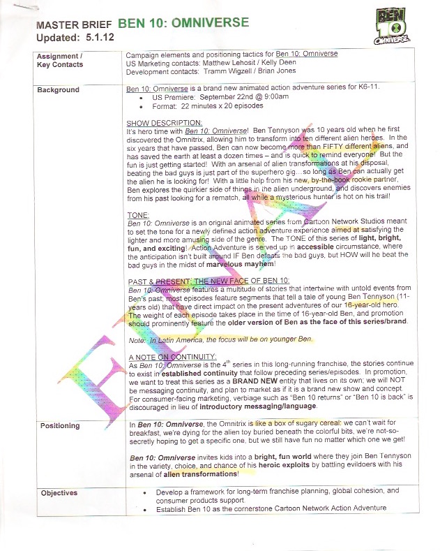
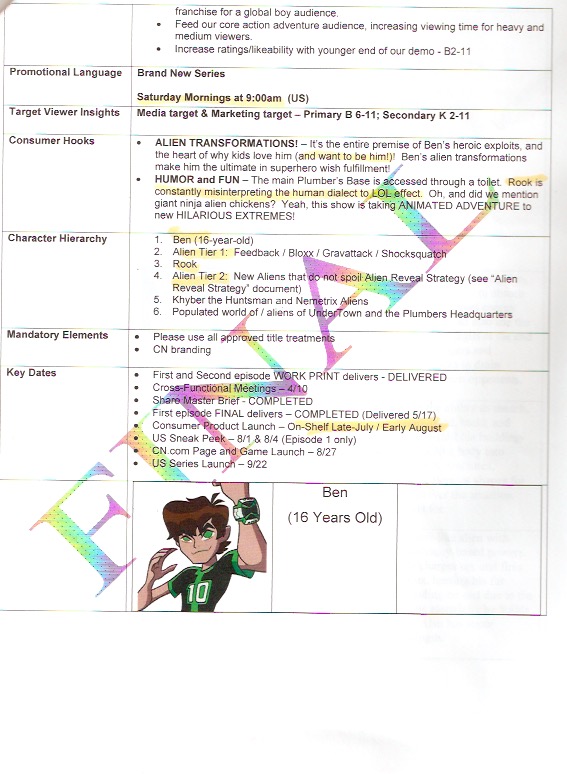
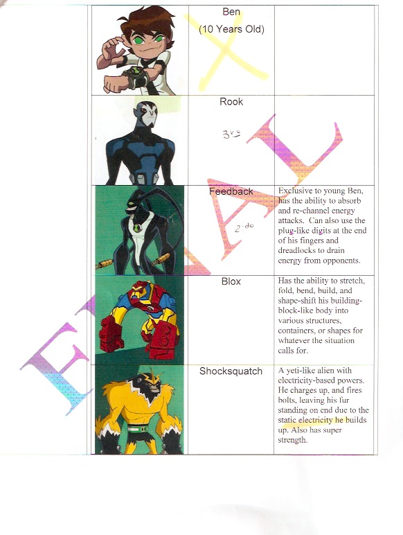
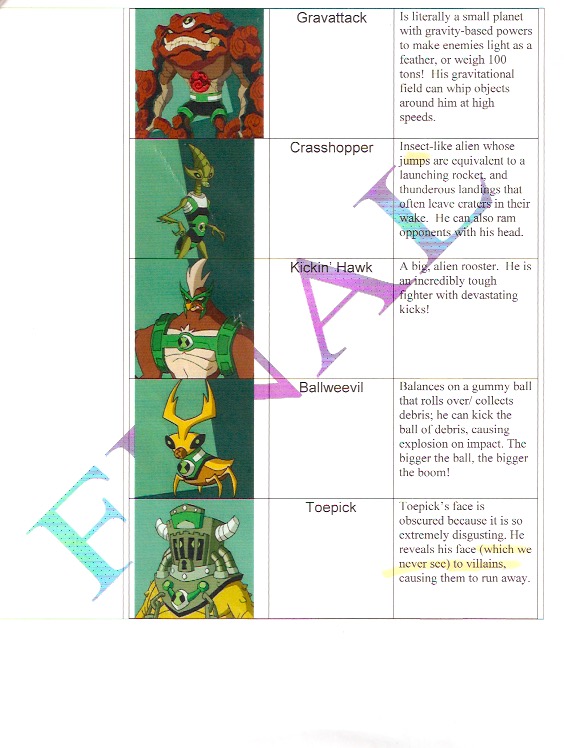
These are examples of the Master Brief from Omniverse. If you compare them to the format of the pictures of the documents @chronosapien234 posted, you'll probably understand what I mean when I say they don't look too official.
-
Plus, why is Diamondhead's design different from the one we saw on that calendar?
-
@Hawk-Kawaii Yeah I understand.
-
@cooljay7 theise are audition scripts
-
@cooljay7 Exactly. I mean, I can understand minor changes during development but that looks like an entirely different style /and/ design. Like I said, the images are somewhat believable but because of the format, the strict non-disclosure agreement, and the inconsistency, I'm gonna have to say my verdict is this isn't real.
-
Some people say it is fake because they all got the same lines! If I'm not wrong, the MLP character Apple Bloom's audition script consists of two scenes, one each from Applebuck Season and Griffon the Brush Off, with her in place of Spike. They probably didn't wanted the VAs to know too much until later!
-
@GoodVibes1999 Ok, having the same lines is not that much of a red flag, but look at the design of Diamondhead and compare that to the one from the calendar.
The other designs are believable.
