New Dutch Promo
-
@Hawk-Kawaii Link is already posted on another page.
http://ben10club.org/topic/56/please-don-t-make-the-reboot-like-this/49
-
@Tactical-Ochoa Sorry, hadn't seen it.
-
@Hawk-Kawaii No worries. Just wanted to let you know.
-
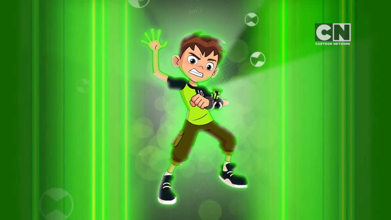
Looks way better than before, I like how the style is maturing a bit and become detailed.
-
I like it. It shows that the show could have some serious moments due to his expression. In the old shows whenever ben would hit the omnitrix he would be smiling unless it was actual danger then he has that serious look on his face like in this art.
-
Very very awesome i understand everything because I have live in the Netherlands cool to see it in Dutch and very awesome picture and promo

 for the dutch readers: hey is super cool om een nieuwe ben 10 plaatje te zien echt te gek.
 -
Very very awesome to see Ben in a serious art like to see that its not only a comedy serie but a action serie to i wondering what mounth it come out in the Nederlands
-
I'm just going to say what I've said before just now on another page. As for my opinions on this image, it's just another image of the reboot Ben but in a different pose and with a different facial expression. Nothing about his actual and physical appearance has changed. Therefore, my views, opinions, and criticisms on the reboot Ben remain as they are.
As for the image itself, this presents nothing new and informative about the Ben 10 reboot. We already know that there's going to be at least some elements of action in this new show. Also, this reboot could either be more action-oriented or comedy-oriented and which ever of the two it is is very much fine to have as long as the show itself turns out to be good. I'm not saying that this reboot is going to be good or bad though. I'm just saying what we're actually seeing here and the way I see it as, all this image tells us about the reboot is what we already know. That's all I'm saying here.
In fact, even though there's that saying "a picture's worth a thousand words," there's also that saying "looks can be deceiving." In fact, the two sayings can connect to each other quite well. I mean like hell, this image came off of a Cartoon Network Highlights 2016 trailer video and trailers are designed to look good to build up excitement for the actual shows themselves. We've seen many times before that trailers had made all these shows, movies, video games, etc look really good to watch yet when the final product actually comes out, we scratch the surface off and see them for what they actually are. An obvious example is the Call of Duty series. Another obvious example is Ubisoft's graphical downgrades in their video games such as Watch Dogs, Rainbow Six Siege, and the recently released The Division. A more specific example is the Aliens: Colonial Marines game. This is just something I also wanted to mention. As stated before, this is just another image of the reboot Ben that came off of a trailer and yet, it gives us nothing new and informative about the Ben 10 reboot itself. Instead, this image just tells us what we already know. That's it. That's all it really is and that's all I'm just saying here.
-
I did manage to get a higher quality screenshot of it!

-
idk does it seem weird to you guys that the omnitrix core is taller then in past shows?
-
@Omni-Triforcer I also noticed this. Guess it's the style.
-
@Omni-Triforcer and a little bit longer
-
@Rexfan1333 I mean it looks fine it's just kinda weird.
-
@Omni-Triforcer i mean a little bit thinner
-
@Ben-10-Fan @Rexfan1333 It's probably a minor inaccuracy. Remember how different the very first promo looked in comparison to this and the last recent one with Fourarms, Diamondhead, and Cannonbolt?
-
It doesnt have to be inaccurate this could be totally accurate it just depends on what the designers want to make it look like. Maybe they thought the thinner longer design looked better who knows.
-
Either way, like I said before, this image of the reboot Ben presents nothing new. This is still the same exact design and the same exact level of detail of the reboot Ben as every other image of him that we've seen. The only difference is his pose and his facial expression and because this image shows the reboot Ben in a different pose, we are looking at him from a different angle. As I stated before, looks can be deceiving. No changes and improvements were made to the reboot Ben's design and level of detail. That's just it. It's just the same exact reboot Ben that we've seen before just in a different pose and with a different facial expression. Even then, when compared to the Original Series Ben's design, the OS Ben is still better designed, better detailed, and better overall than the reboot Ben.
-
@Tactical-Ochoa yeah, I understand it's nothing new to the design, but at least it looks serious compared to most recent CN shows (I'm looking at you PPG reboot and TTG!), all we can do is wait for a trailer and see what happens, CN owns it (I hate that they own it and wish MOA would take it away from them, but that will never happen), I wish we could have a more anime style like the original, but not happening anytime soon. I just hope we might get Teen Ben back but better portrayed than the others.
-
@Rexfan1333 Never doesn't always apply. If MOA plays their cards right, they can take the Ben 10 series away from CN and find a better network company that will allow them to make their ideal Ben 10 show.
-
Actually I think MOA is pretty fine with Ben 10 on CN. I am pretty fine with that and most fans are pretty fine too! Not everyone wants a darker and edgier series.